
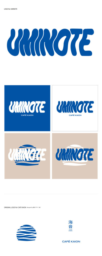
CAFE KAIONの情報コンテンツ『UMINOTE』のロゴデザインを作成しました。CAFEKAIONは小浜町と小浜住民、小浜町と外の地域の人たちを優しく接続するHUBを目指していきます。そのための取り組みとして、今回は情報コンテンツにUMINOTEと名前をつけて発信することになりました。SNSやweb媒体にとどまらず、カフェ空間とも柔軟な相関性をもたらし、縦横無尽なコミュニティデザインをこれから作っていきます。その一助として提供できたことをとても嬉しく思います。
I’ve created the logo design for CAFE KAION’s information content series “UMINOTE.” CAFE KAION aims to become a gentle hub that connects the town of Obama with its residents, as well as with people from outside the region. As part of that effort, we’ve named this information project “UMINOTE” and will begin sharing content under that title. Our goal is to develop a flexible relationship between the content and not only social media and web platforms, but also the physical café space itself—creating a fluid, multidirectional approach to community design.
UMINOTEのロゴをデザインする際、CAFEKAIONのブランディングで既に使用されているロゴやフォントデザインをベースにして決めていきました。既存のロゴの波間が揺らいでいる形に合わせ、柔らかで優しい雰囲気のあるような『UMINOTE』のロゴを作成しました.。
When designing the UMINOTE logo, I based my decisions on the logo and font design already used in CAFEKAION’s branding. Aligning with the existing logo’s wavy, undulating shapes, we created a ‘UMINOTE’ logo that conveys a soft and gentle atmosphere.
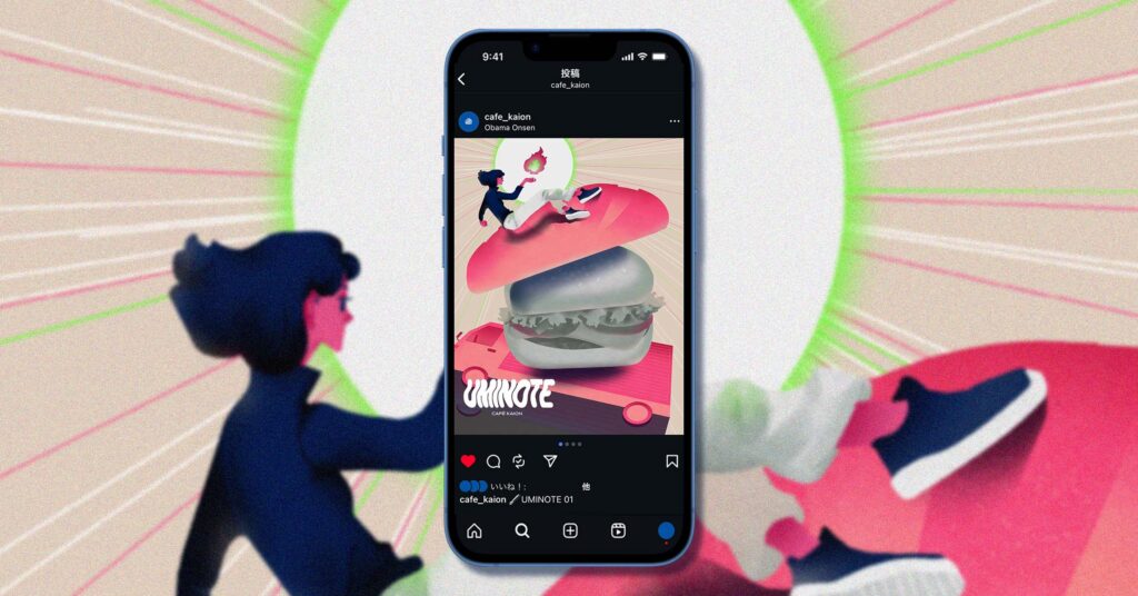
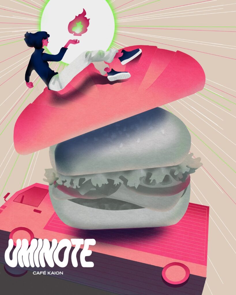
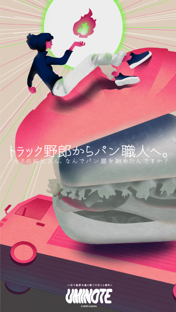
01回目のインタビューnoteを象徴するキービジュアルの制作も行いました。
I also created the key visual symbolizing the first interview note.